A gallery exhibition and a commercial campaign may serve different purposes, but the visual discipline behind both can be the same. In Maria Panina’s work, fine art photography is not separate from fashion, beauty, or hair imagery. It is the foundation for it.
Her first solo exhibition, Quiet Strength, opened on July 1, 2026, at El Barrio Artspace PS109 in New York City. The exhibition presented 28 photographs alongside a live dance performance by Shoko Tamai. Its subjects included portraiture, movement studies, still life, and collaborative images exploring trust, connection, vulnerability, and resilience.
For creative directors, art buyers, and brands, the exhibition offers a clear view of how Panina’s artistic practice translates into editorial campaign photography. Her images begin with form, but they do not stop there. Light, styling, texture, gesture, and movement are treated as structural elements within the frame.
A sculptural approach to the subject
Panina approaches the human figure as a composition of planes, curves, textures, and lines. A portrait is built rather than simply captured. Hair, makeup, clothing, posture, and shadow work together to create an image with physical presence.
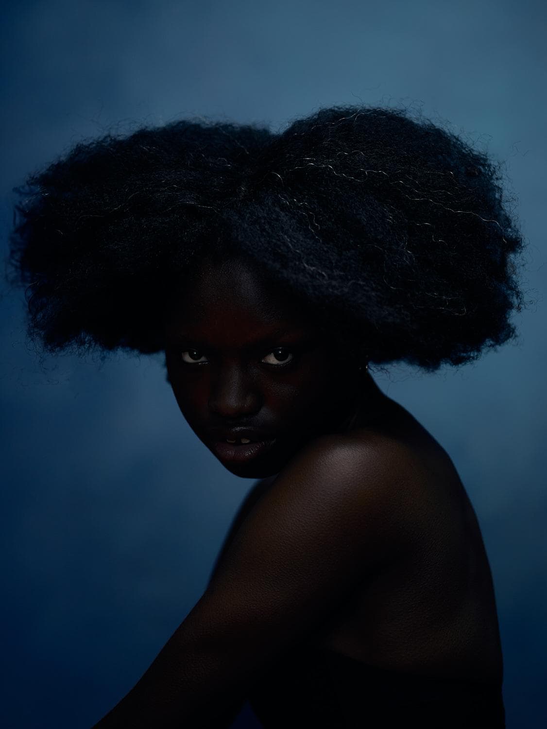
In Ogechi, the face becomes both subject and structure. The image gives attention to the architecture of the features, the surface of the skin, and the relationship between the figure and the surrounding darkness. The result is a beauty portrait with the precision of a study in form.
That approach has direct value for beauty and hair campaigns. Products are often designed around transformation: the shape of a hairstyle, the finish of skin, the intensity of color, or the graphic quality of makeup. Panina’s work gives those details room to function as visual architecture.
For a hairstylist, the image can make volume, silhouette, and texture central to the composition. For a makeup artist, it can emphasize color placement, skin finish, and the relationship between makeup and light. For a beauty brand, it can create a visual world in which the product is part of a larger, recognizable point of view.
Movement as a visual language
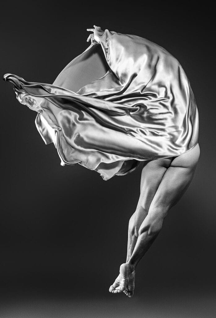
Movement is one of the strongest connections between Panina’s fine art work and fashion imagery. Her movement studies do not treat motion as a simple effect. Gesture becomes a method of shaping the photograph.
In Movement Study. Mercury, the body, fabric, and light suggest motion without reducing the image to documentation. The frame holds a moment that feels suspended. It carries the energy of dance while retaining the control of a composed studio image.
This sensitivity to movement is especially relevant to fashion campaigns. A garment is not fully understood when it is seen only in a static pose. Its weight, flexibility, volume, and response to air are revealed through movement. A photographer with a dance-informed eye can direct the body and fabric together, creating images that communicate how clothing behaves.
The same principle applies to hair campaigns. Hair can be photographed as shape, but it can also be shown in transition: lifting, turning, unfolding, or responding to the movement of the head. Panina’s experience with gesture allows the image to remain precise while still feeling active.
Her interest in dance and motion also changes the working process on set. Instead of asking a subject only to hold a pose, she can build a sequence of gestures and select the frame in which the body, styling, and light reach the strongest relationship.
Dramatic lighting with commercial clarity
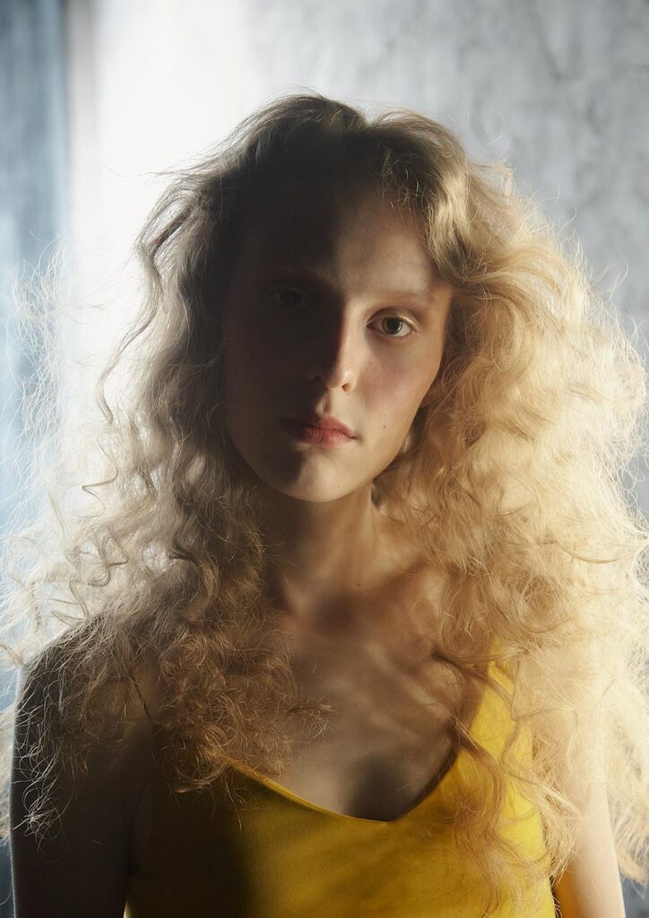
Panina’s lighting is dramatic, but it remains deliberate. Deep shadows create atmosphere and dimensionality, while controlled highlights direct attention to the face, body, garment, or material detail.
This balance is important in commercial photography. Campaign imagery must be distinctive enough to establish a brand identity, but clear enough to communicate the product. Dramatic light can support both goals when it is used to reveal structure rather than obscure it.
A sculptural beauty portrait may use a narrow highlight to define cheekbones, hair, or the edge of a profile. A fashion image may allow a beam of light to separate sheer fabric from a dark background. A hair campaign may use contrast to show the difference between matte and gloss, softness and rigidity, or natural texture and constructed form.
In Rain, atmosphere becomes part of the image’s physical surface. Water, light, and the figure interact to create a frame that feels tactile and cinematic.
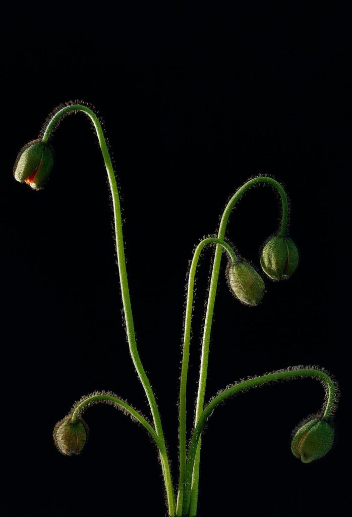
For brands, this type of lighting offers more than mood. It creates a consistent visual system. A campaign can move across portraits, details, and wider fashion frames while retaining the same relationship between shadow, color, and form.
Bold color and controlled contrast
Color is another defining element of Panina’s visual language. Her work often places saturated tones against restrained or dark surroundings, allowing color to carry compositional weight.
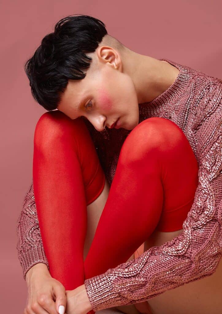
In Olya in pink, the color of the styling is not an accessory to the portrait. It establishes the image’s visual temperature and shapes the viewer’s attention. The use of pink becomes part of the subject’s presence, connecting fashion, mood, and graphic design.
This approach is suited to fashion and beauty brands working with strong palettes, seasonal collections, or visually specific product lines. Bold color can define a campaign across print, digital, social, packaging, and editorial placements. Panina’s fine art background helps keep that color purposeful rather than excessive.
Her eye is also attentive to contrast: blue against skin, red against black, metallic surfaces against soft fabric, or a vivid garment against a minimal setting. These relationships create images that can stand alone while still belonging to a broader campaign system.
Texture as content
Texture is often where a photograph becomes memorable. Panina gives attention to surfaces that can be felt visually: skin, hair, water, fabric, makeup, and organic forms.
That attention is central to beauty and hair photography. The image must make the viewer understand finish. Is the skin luminous or matte? Is the hair polished, airy, sculpted, or textured? Is the fabric sheer, reflective, heavy, or fluid?
A fine art sensibility encourages close observation of these qualities. Rather than treating texture as a technical detail, Panina uses it to build meaning and depth within the frame.
Her movement work also shows how texture changes through action. Fabric folds, stretches, catches light, and creates new shapes as the body moves. Hair shifts from silhouette to surface. Water transforms the relationship between the subject and the background.
Connection, collaboration, and direction
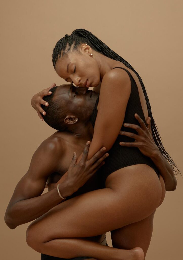
The photographs in Quiet Strength also reflect Panina’s interest in collaboration. The exhibition included work from The Connection Project, a body of images focused on trust, presence, and relationships between subjects.
That collaborative approach is relevant to commercial production. Strong campaign imagery depends on communication between photographer, model, stylist, makeup artist, hairstylist, creative director, and client. The photographer must provide direction while remaining responsive to what develops on set.
Panina’s images leave space for that exchange. The subjects do not appear disconnected from the process. Their gestures feel considered, but not mechanical. This is particularly valuable for campaigns involving beauty teams and performance-based styling, where the final image depends on a shared understanding of movement, shape, and timing.
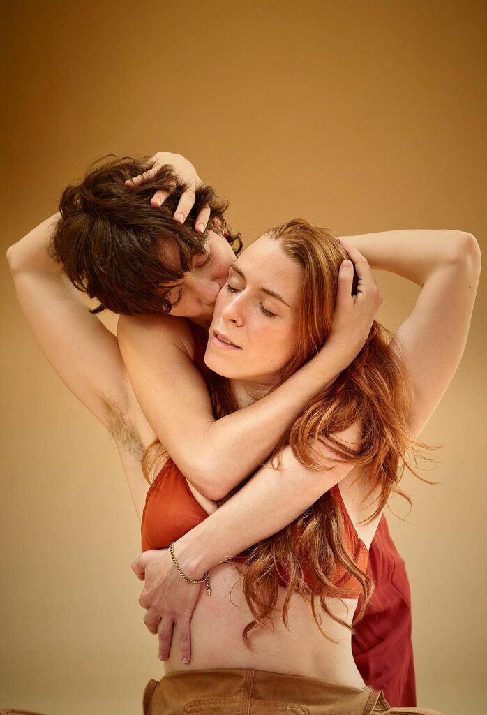
The live dance performance by Shoko Tamai at the exhibition opening further established movement as an important part of Panina’s artistic practice. Dance is not simply a subject within the work; it is a way of thinking about space, rhythm, balance, and the body.
From gallery work to campaign imagery
The value of a fine art practice in commercial photography is not that it makes a campaign look like a gallery installation. The value is in the depth of visual decisions behind the image.
Panina’s work brings together:
- Sculptural composition
- Dramatic, dimensional lighting
- Bold and controlled color
- Close attention to texture
- Direction shaped by movement
- Collaboration with performers and creative teams
- A balance between emotional presence and visual control
These qualities can support a range of commercial assignments, including beauty portraits, hair campaigns, fashion editorials, launch imagery, lookbooks, and branded content.
The work in Quiet Strength demonstrates how Panina builds images that remain visually specific without losing clarity. That same approach can give a fashion or beauty campaign a distinct visual identity: one grounded in form, movement, and the physical qualities of the subject.
For brands seeking imagery with an editorial and fine art edge, the gallery and the campaign are not opposing directions. They are connected through the same attention to light, structure, and motion.
Explore Maria Panina’s photography and commercial visual work.